This was my view for a good part of yesterday!
Getting that Lozenges Leader & Ender Challenge Quilt into the machine and getting the quilting going.
My days in between teaching trips are NUMBERED..I leave tomorrow and I wanted this at least to the binding stage!
I had toyed with the idea of also piecing a batting, but the time was just that limited.
No, a pieced batting is great for smaller quilts, but this one is 84” X 91” and I just didn’t want to take the time to do it. That can wait for another day.
Loaded, quilting started – I chose a lovely edge to edge design by Patricia Ritter of Urban Elementz called Pinwheel #1:
Yes, that is a lobster tail!
I’m loving this design!
Uhoh! Someone forgot to remove a pin!
Luckily this area wasn’t quilted yet and I could reach between the layers and get it out of there. I always worry I will leave pins in the seams….because I often do!
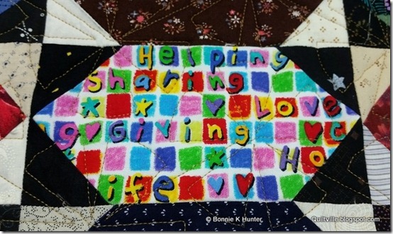
I love this block! #thisiswhatitsallabout!
Through this whole process I’m thinking of what color of binding to use!
What do you like? The green? or the blue?
That green is really speaking to me!
Quilted and trimmed!
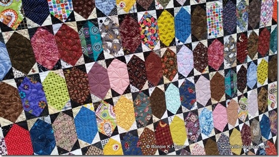
What a fun pattern! I love the texture!
It may have taken a year, but it was so WORTH IT!
Oh, don’t forget the back! Remember that pile of browns?
I added some leftover 3” units and the left over lozenges in columns between the panels! SO happy that brown has found a place to live. It’s not bad here. There are a lot of older brown fabrics in the top, some newer civil war reproductions as well as 1990s old VIP calicoes…it all works! And I am so happy for the little bit of breathing space in my use-it-up-as-a-backing closet and have it gone.
It’s good all around!
So did you see last night’s post about Celtic Solstice being available as a Digital Download pattern?? Check it out!
**Note** If you were ordering this morning – there was a small window of time where I was editing a typo, which meant deleting and uploading the new file. If you placed your order during this time and your download doesn’t work, try it again.
If it still doesn’t work, email me. I’ve got your receipt records and can just email you the new corrected copy. It’s hard to upload a file at times when people are trying to download a file.
Thanks for your patience with my first foray into the world of Digital Downloads.
Next up will be Grand Illusion. It was supposed to retire May 1st, but I let it sit because May was so crazy.
After that – I have a couple in mind, things that wouldn’t fit books-in-progress but would be great there as stand alone patterns.
No worries, the things that are free under the free patterns tab will ALWAYS be free.
Some for free, Some free for a time (Mysteries), Some for download, and some in magazines, and some in books….I think we’ve got it all covered!
Oh yes, and online classes are being filmed in Denver in August with QNN – that’s one more base to cover!
Whew! I’m tired already!
And I need to pack for Jamestown, New York and Erie, Pennsylvania for my trip TOMORROW!
Later!


Love it. Fabulous scrappy quilt as usual.
ReplyDeleteWould you consider black for the binding on this quilt?? Your quilt is beautiful!
ReplyDeleteLink_clnc@sbcglobal.netGood Morning, Bonnie
ReplyDeleteI am wondering if you use a computer program design or a laser when you quilt. I am looking into a different quilt machine and it is very confusing. Thank you ��
Lisa
Link_clnc@sbcglobal.net
This is a great finish! It was fun listening on Quiltcam when you put the last stitch in the top. Safe travels. Congrats on the new venture with digital patterns. You go girl! :)
ReplyDeleteLoved seeing you out the top together on QUILTCAM. It would be good to see a close up on the Pinwheel design. Great finish. Safe travels and can't wait for the next QUILTCAM
ReplyDeleteoh yes i like the green too...will give it a zing!
ReplyDeleteI think offering some stand alone patterns for a price, as PDF downloads, as paper patterns or as digital options is definitely a fair and reasonable thing for you to do. Don't let those who criticize this idea get you down. You should be getting compensation for what you do, I can think of very few people in this industry who work as hard as you do, and you deserve to be reaping the benefits of all your hard work. I can't wait to be in your class at the Vt. Quilt Festival in a few weeks :)
ReplyDeleteBonnie, lovely job as always. I like the green for the binding as I think it would give a finishing "pop" to the entire quilt. The blue, obviously, would work as well; however, at least the way my monitor is displaying the colors, the blue would be a subdued, "blend in" with the quilt top.
ReplyDeleteI think you're right - the green binding will be great. In the full shots, the yellow and gold units really stand out, and the green will compliment those. Also, it will look nice against the browns on the back.
ReplyDeleteCongrats on the new digital pattern release. Nice of you to provide so many options for your loyal fans!
PS - I don't buy many quilt magazines, but I did make a point to pick up a May/June copy of Quiltmaker, mainly for 'Garden Party' and 'Idaho Square Dance.' Those are both seriously fun patterns. Can't wait to give them a try.
Hi, Bonnie! That green practically jumped up and waved both arms to be chosen from my screen. Definitely go with your gut and go with the green. And I cannot believe with all you have done this year already and the trips on the calendar for fall, you will also be taping classes on QNN. WOW! Really, Bonnie, I think your calendar this year must top all prior years. I do not work at your pace, but I am definitely being dragged on your coattails and accomplishing more than I would have without your inspiration. Thank you.
ReplyDeleteI am just finishing up a scrappy quilt and have decided to go with green too for the binding. So yep, I vote green too. I wish I had my scraps organized enough to pull off this quilt. I really love it. Thanks for all you do Bonnie. I particularly like all the options, I have your books, follow you in magazines and now I can have a pattern right at my finger tips.😀💙💐
ReplyDeleteDo you have the trimmings off the backing fabric? Scrappy Binding. I'd use Brown to match the back. The Lime Green would be #2 choice. I love the texture of that panto too. Happy Packing day!
ReplyDeleteGreen! Anything else would pale in comparison!!
ReplyDeleteLove the Lozenges quilt and as far as binding goes....I often have pieced bindings on my quilts with complimenting colors and designs. I'm not much for one solid looking binding. So I say use BOTH green and blue (and any other colors :)).
ReplyDeleteI just moved last Sept. from the Erie, PA area to AZ and I can't believe I'm going to miss meeting you and taking your class :( Hope you have good weather...Erie is unpredictable.
Always love blue, but the green looks fun & cheerful.
ReplyDeleteI love both the blue and green. Could you do one of those bindings with a flange and use both colors? It would be a little more work but would look great with just a little pop of blue with the green binding.
ReplyDeleteYour lozenge quilt is fabulous and I know there will be one in my future!
Pam, a huge fan from Wisconsin
Well... I think blue but green is my favorite color!! Both will be great with the back. I love what you are doing. Keep up the wonderful work.
ReplyDeleteAt first, I was not a fan of the lozenge quilt, but with it finished and quilted, I have really taken a liking to it! My personal choice for the binding would be blue, but it do like the idea of the flange type binding and using both colours. Either way, it is now added on to my ever-growing "stuff I want to make" list. Try to catch your breath before you head out again!
ReplyDeleteSorry, but I can't go with either the green or blue. I'd do a nice dark brown that would complement both the front and the back. Just my two cents. :-)
ReplyDeleteUse both and mix it up!
ReplyDeleteThis looks amazing. Just love it.
ReplyDeleteRE the download kerfuffle. The ultimate would have been to delete her posts and block her without explanation. You would live rent free forever in her head! haha
ReplyDeleteWhoo hoo. Great lozenges. Needing to check out celtic solstice too.
ReplyDeleteWhen looking at the entire quilt online the blue pops out and I don't even see the green....so I vote for blue binding. With all the brown in there what about red binding! The visual texture in your quilt is fanciful! Never would have guessed that while it was in the making. It just had a nice old fashioned look then.
ReplyDeleteHi Bonnie. The lozenge quilt looks great and you got it done so fast! Can I ask if you did the pantograph manually or do you have a computerised system? I like the green for the binding too, it will give it zing. Janet
ReplyDeleteThe Lozenge quilt is wonderful. I love that as a great designer and teacher, you don't mind telling us your mistakes, like the pin. Thank you for a beginner quilter.
ReplyDeleteVery nice! Green or Blue, ha, ha, I like the brown showing in your one deck post that's beside you quilt. LOL, I just have to be different and not answer the green or blue question, sorry!
ReplyDeleteBonnie I love your Lozenges quilt. Would you mind letting me know your dimensions on your "H Quilt" ~ I would really like to make one for my son! Thanks, Jo Stovall (jo_stovall@yahoo.com)
ReplyDeleteI like both colors so I would use the blue binding with the green as a flange.
ReplyDeleteLinda
Blue or brown binding. The green would stand out too much.
ReplyDeleteGreen, definitely!
ReplyDeleteI have a question regarding the digital download: If I bought the pattern BEFORE you discovered/corrected the typo - would I then get a new copy automatically?
So happy for all your blogposts - really fun to see how you get around and how much you accomplish in 24 hours:-)
Best regards Brit
britschj@gmail.com