Thirty excited Quilters --- ready to plug in their machines and tackle the scraps!
That’s what we arrived to find yesterday at the Magnolia Fire Hall. It was a really great class.
My favorite thing to do is take note of WHO matched their project the best!
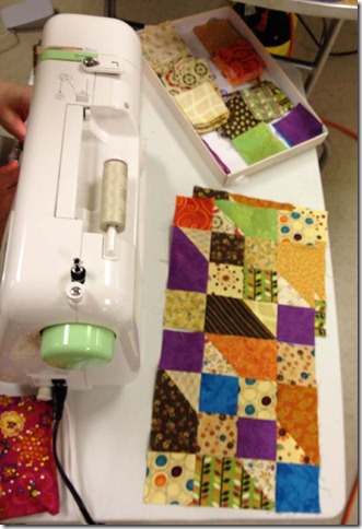
This sweet Quilter won the prize hands down….I want you to take notice of the “apple green” theme going on…..First notice the green crocs…then….oh, the green is reflected in the green details on the sewing machine, and also the sweater she chose to wear. She was READY to roll on her quilt…
And just to carry on the theme….these are her blocks…they pick up the green color too!
She wasn’t the only one of course, we had quilters dressed in pink, with pink cell phones, and pink bluetooth ((Pinktooth?!)) earphones sewing on fabulous pink quilts and loving being in “their element” It’s just fun to notice, and everyone was a good sport with my razzing!
One of the other things I also love is when people ask me to explain a bit farther on a subject --- ANY subject. Because I don’t know what they really want to know unless they ask.
In this case it was a discussion on lights vs neutrals, darks vs colors.
You know, that whole light-medium-dark thing can be so broad in spectrum that it can be really confusing. And even though a neutral ((white, cream, beige, taupe, tan)) can be considered as LIGHT, so can any color of any fabric as long as it is “lighter” in value than whatever fabric it is placed next to. This can really muddy the waters, can’t it?
Sometime that spectrum is SO wide ---that if I go strictly by the lightness or the darkness of the fabric, if the “backgroundy” shades have TOO MUCH color in them, the background starts to fight with the foreground and muddies the definition of what is the block design --- and what is simply background. Did you ever notice that?
So we had a good discussion on how I categorize mostly by whether a fabric is “neutral” or “color’. We flipped through one quilters squares and bricks and asked each other where we EACH would put that fabric by category. It was a great discussion.
I also know that I can put the palest pastel shades in the “light to neutral” category…but if those pastels pass a certain intensity they wander into “medium” territory, and I’d rather use them as a COLOR in the main block design, but not use them as background, because there is just too much color. You gotta follow your own instinct as far as what you consider too dark to be background --- it might be better as main block parts. Work with it ---it will come!
Take a look at what we got up to in class:
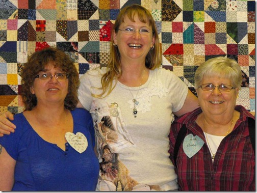
This is Carrie, Myself, and Carrie’s mom, Anne who have been key in organizing this whole shindig --- I couldn’t have done this without hem, and we’ve been having a great time!
Today’s class is a String Spider Web workshop – and tonight is the lecture/trunkshow at the guild meeting, so this is my BUSY day ---
Have a great ----wait --- what day is this? Oh yeah, MONDAY everyone!


I can't get Carrie's link to work! I love the gren on that sewing machine and it looks like everyone had lots of fun.
ReplyDeleteThank you so very much for the frank discussion on lights that are actually mediums! Over the course of the last two years of sewing with your patterns, I have come to change my buying style to avoid those muddy mediums--no matter HOW pretty they are! In this slideshow I was able to see several examples of where a deeper toned light (such as a caramel color) was fighting and not playing nicely.
ReplyDeleteYou are such a good teacher!
I love the pictures. Such fun.
ReplyDeleteMaryella
It was a great day Bonnie! Thanks for a fun workshop!!
ReplyDeleteI really like that table that they all seem to be using for their sewing machines. Any info. about that?
ReplyDeleteLooks like everyone had a very productive day.
the tables came from Sams Club several years ago... cant seem to get them there anymore... they are made by lifetime... you can get a less sturdy version of them from like big lots...
DeleteCarrie
I agree with GMP above, that low table is a real deal. Would like more info if available.
ReplyDeleteLove the pics, Bonnie. Everyone seems to be having so much fun.
Have a great Monday.
Faye
Hi, if you are talking about the smallish tables you can find them at Costco. They are Lifetime folding tables. Hope that's what you were looking at! Have a great day!
ReplyDeleteDid you notice in photo #20 that one of the rectangles is wrong. hope she notices and can fix it. loved the talk on colors, can see the difference in some of the blocks. Ramona from Maine sewnsew@live.com
ReplyDeletejust joined with Google, wanted to see if it worked. Love you Bonnie
ReplyDeleteI was interested in those little tables too. I did a search on Amazon and found one. :) It is called 'Lifetime Personal Folding Table'.
ReplyDeleteThis was one of the first patterns that I saw when I started following this blog. I got out my scraps and started it then. I have about half of the blocks for my quilt done. It makes me happy to see this slide show. Thanks Bonnie!
ReplyDeleteGreat Slideshow - thank you! Now that I have finally finished my Cathedral Stars, I shall not feel bad being tempted by your great patterns!
ReplyDeleteA really great discussion of the color choices when doing the scrappy quilts you teach us to love. It is slowly coming to me and I am making better choices. Thanks again.
ReplyDeleteGreat slideshow as usual! Always makes me want to go sew.
ReplyDeleteI just had this occur in making a quilt with a friend. We chose a (high) stack of fabrics to cut strips for a scrappy quilt. I thought a few of the fabrics were too light, not enough contrast with the background fabric, which was the same throughout the quilt. She wanted to include them, so we did. the top does have places where there is not enough contrast, but since the background is the same throughout it's ok. To me it came down to making my friend happy, not making a perfect quilt. My piecing skills prevent that anyway.
ReplyDeleteStill working to get better, and enjoy your lessons. Blessings :c)