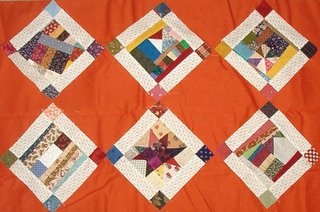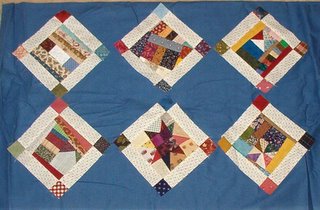

Here are a couple more shots auditioning solids. Some quilters don't like to use solids, and sometimes I DO...because it gives a great place to break up the busy-ness of scrap quilts, and when quilted, solids show the texture in wonderful ways that aren't seen when the top isn't quilted. What looks flat unquilted, gives alot of WOW when it is!
So here you have it...crazy puss in the corner blocks on a medium blue, or crazy puss in the corner blocks on a pumpkin rusty orange. Any Takers? Both of these are from the stash and I have enough to do the whole top from either of them.
I also have the same civil war green that I used for my string point star, but then this quilt would match it? :c/ Not sure I want that. But here is a pic of that one... http://quiltville.com/6ptstringstarclose.jpg
So what does the jury say now? And can you see sometimes why a solid is best, even if quilters aren't so excited to work with them?
Bonnie

Um... well... you might not like this, but here goes. I love solids 'cause you are so right in that they look gorgeous quilted. And well, I tipped my head and I like the blocks with alternate plain blocks, not on point. It gives it a very old-fashioned look. Maybe too old for the victorian crazy look... But I like it. How's that for Maverick? Have fun and try not to over-think it. Kinda like those multiple question tests.
ReplyDeleteOh, and please tell about the soup... other than turkey carcass, what do you put in it. My boys love just rice and sage, but I was curious...
ReplyDeleteBonnie: I like both the orange and the blue. If it was for me, I'd probably uses the blue but then I would think . . the orange looks really good and if I don't use it for this project, what else will I use it for? And, I'd probably use the orange. How's that for being non-decisive?
ReplyDeleteJudy L.
I like the blue more for these blocks. It seems more complimentary and flows better to my eyes.
ReplyDeleteAnd honestly, the orange reminds me of my parent's plumbing company, they have huge orange trucks. :P
I think the blue is more calming. That said I love orange so I'd probably use the orange.
ReplyDeleteBTW, soup looks great! I've never made turkey soup but will be putting my carcas in to boil once I cut the rest of the meat ogg this morning.
Yip!
ReplyDeleteThis is a fella reeli 'mirin yor qwilts cos long tim 'go I uze tu trorl cirtin Lundin streets an fine ol sots o meteeral stuf tht shops jus chuk ot on the sidwak lik thos sampl boks. In win I git them boks hom I seprait th mateeral an ol an wit mi fot on mi ol Frister&Rossman lectric sowin mashin I soe them varios peecis togethr int 2 a big big big cullid sheet mad up ov ol sort sizis & pattin wit ot eni "shud ths go ere or shud ths go ther." Thin, I bak upt th cullid sheet wit plane bakin stuf. & thin wit bit mor tinkrin I hav misel sum mitey nise curtins - Lok reel Joyfil cum rane or shine!
Bi-th-wa Av yu mad a qwilt in lis tradishnul wa - I wud reeli lik 2 se a pictor on yu site?
Thinkyu
Bonnie! I LVOE these - I take the dark comment back. I like the blue the best but the orange/red is wonderful too! Oh go with one of these!
ReplyDeleteHave to say I'm partial to the orange - it's zingy. Blue definitely calmer. Depends on what effect you are going for. No matter what you decide, the blocks are great and the quilt will look awesome.
ReplyDeleteI like em both, even though I am a self-confessed non-admirer of solids. (Probably because my style is so different than yours, solids look really blah with my wilder quilts. Or maybe just because I am very bad at doing anything in a calm way??)
ReplyDeletePersonally, I'd go with the orange as the blue is too calm for my tastes- so that may be a great argument for the blue! ;-) LOL!
The orange brings out the colors in your prints IMO :) both look nice. Melody
ReplyDeleteI like the black and grey the best. They add such a nice richness and I don't think they are too busy. I think the plains are just too plain. But I can see how a nice quilting job could fancy them up.
ReplyDelete