
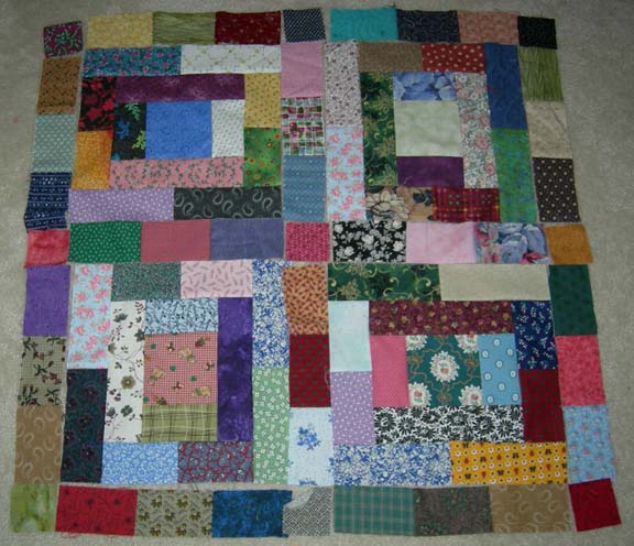
This is a pic of 4 of the blocks separated by the sashings (made from 3 bricks) and filled in at the corners with 2.5" cut cornerstone squares. If I set the quilt this way...it is going to be VERY much bigger....I have 30 blocks to set 5 X 6.
Anyone think that the blocks look more like the pavement picture below by the addition of the bricky sashing between the blocks? HELP!
Bonnie

12 comments:
Hi Bonnie,
I think the top version is closer to the feeling of the cobblestones. Actually the cobblestones look like one big log cabin. I think once you have it quilted you will like the results.
I definitely prefer it with the sashing - and I agree with Martha, your quilting will make this another stunner :-)
The sashing looks good - but since I love scrappy quilts, to me it would look good either way.
I like the top one Bonnie.
I love the idea of following the pattern of the cobblestone. Just makes it seem so inspired.
Love all the pictures you have been sharing
Have you thought about making the sashings either a very light mix of bricks (like pale mortar; in white, offwhite, beiges, etc.) OR a sashing of very dark bricks (so the effect would be like the dark shadowed 'crack' between cobblestones?
Right now, all bright and pretty on your floor, it reminds me not so much of paving stones, but of the illustrations I saw as a child of Joseph's Coat of Many Colors. :)
And HOW do you keep the cat from tearing thru your neat arrangement and scattering the bricks everywhere? lol
I agree with forestjane - I'd like to see the sashings contrast with the blocks :)
What if the bricks were narrower? I'm watching closely; might try this with my bricks. I can't wait to see what you do!
I'm wondering if maybe since you want the cobblestone or brick walk affect, if you've considered sorting the bricks and leaving out the darker pinks, yellow, busy etc.? Focusing on things that are more gray, tan, rust, blue, softer green, lighter purples. More the colors you'd see in the pavement, both brick color and shadow coloring?
It almost seems you have two quilts in your head. Wanting to do the bricks picture look and wanting to do what the Gee's Bend quilts do. Maybe you can't use every scrap brick in this quilt...just a thought.
I think what you are missing is the morter. Maybe what makes the real bricks look so seperated is the morter. They seem like chunk's set in something..where as the fabric bricks run together. or course they are already sewn and it would really be hard to un-sew. The more I look at it, I think it's the space that the morter provides. I wonder if even a 1/2 inch beige or black spacing would do the trick. Wow that would make it really huge, huh?
Just a thought. I emailed you, hope you got it.
I think it would be a cool pattern if you made the sashings stand out a little better -- either make them all solid color fabrics, or dark or light. I'm finally getting inspired to start quilting again -- thanks! I needed that!
Bonnie,
NEAT...I'm not much of a scrap quilt person, but i LOVE the way it looks below in the "ewwwww?" post!
Hugs
Laurie
I'm going to add my two cents worth. I love the blocks, but I vote for a "mortar" for the setting strips. If it were my quilt I think I'd use a solid black. I love the way solid black makes all the other fabrics in a quilt sing.
Post a Comment
If you are commenting as "anonymous" please leave your name at the end of your comment.
Did you know that ad space on this blog provides for all of the free patterns and free mysteries and challenges at no cost to you? Without ads, this blog would not be possible.
Thank you for understanding the many hours that go into this blog 6 days a week, 52 weeks a year. :)