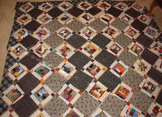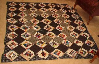

These are the crazy puss in the corner blocks I've had on the back burner for a while.
With encourgement from Finn to play today (who wants to be out and about on black friday anyway?? NOT ME!) I have been playing with layouts for these. I tried straight with sashings. Didn't like it. I tried diagonal with zig-zag setting..didn't like it plus I didn't want to have to make half blocks. So I thought I'd just set them on point so they would 'chain' due to the sashings and corner stones on the blocks. BTW..the 1.5" corner stones are all precut from my 1.5" scrap square bin. 56 blocks X 4 cornerstones each is 224 squares used that I didn't have to stand there and cut, just dug them out of the bin. Weehaa...
Anyway, back to the setting. I thought I could do color rounds...had a gold as the outer edge/setting triangles, a blue the next round in, a red the next in from that, and black in the center 6 blocks. Kind of a trip around the world setting. TOO BUSY. I didn't like it at all and here I am now with all these pieces I cut. I am the kind of quilter who has to lay it out to audition it....
I DID like the black 6 center squares, because they really make the black pattern in the white shirting sashings stand out. So...I thought blacks and greys! I always wanted to do something with all these mourning prints I'd collected. Here is the layout. I still think it's too busy?
HELP! Maybe these little crazy blocks are so busy and so charming on their own that they need ONE solid background color to showcase them? Please let me know what you think and what you would like to see them set with!
Bonnie

10 comments:
Do you have enough of that darkest(black?) color to do all the interior setting blocks from it, or something similar to add to those?
I REALLY like the dark...it does showcase the little blocks, and I REALLY like that check or whatever it is, just as the setting triangles. Then I think I'd bind it with all reds, or all yellow, or such, ya know??? Not varigated scrappy, but possible scrappy in the same color range.
New thought..what if you deliberately pull out 1 or 2(or whatever you think) of the puss in the corner blocks and stuck in an album patch in that same size, or a churn dash, or some other obviously orphan block???
I like it!!!! It is not to busy . It gives only your eyes more to look at :c)
To me it seems that there is something "off" about those 6 darker blocks in the center. Maybe if you cut each square in 1/2 to make a triangle (more cuts for the corners) - keep the dark for 1/2 which would create a frame and then use lighter fabric on the outside edges. Does that make sense? It is a NICE quilt, I do like it!
Cheers!
I think just one black fabric for all the setting blocks. That would give your eyes a place to rest after the business of the blocks.
I like them with the black -- just black, not the grey, too. I also like the blue plain setting. But, I think the black really sets them off best.
JMHO!
I'm with Lucy - I like it just the way it is and don't think it's too busy :) Gives a person alot to look at.
Bonnie! I love these scrappy blocks! How fun is this quilt! Are you going to make this one a pattern too? I LOVE it!
I like the dark center with the lighter ring and then dark again. But all dark would be great also. These are such fun blocks!
Goodness Bonnie! You are really cookin'! And not just the turkey soup either!
I'm just getting caught up with the Mavericks...so when I began your page...I of course noticed your two different settings with the "Crazy Puss-in-the-Corners" and the red and the blue solids. Well, me being a "red" person...really loved the blue setting more. It just seemed very calm and antique-ish.
But then...scrolling down to this posting...I love this setting just as much or even more than the blue solid squares! And just exactly like it is! It gives those "Crazy" blocks a whole new look and feel.
I can't wait to see what you decide. Thanks for sharing!
Darcie
I like the orange background.... Totally makes the pieced blocks POP!
Post a Comment
If you are commenting as "anonymous" please leave your name at the end of your comment.
Did you know that ad space on this blog provides for all of the free patterns and free mysteries and challenges at no cost to you? Without ads, this blog would not be possible.
Thank you for understanding the many hours that go into this blog 6 days a week, 52 weeks a year. :)