
I’ll be off to the airport in a few ---- Boy, is it a GLORIOUS April Saturday Morning out there!
I finished quilting Florabunda ----but I couldn’t photograph until this morning when there was daylight on the deck…but not too much, gotta catch it while it is still shady! And now that the trees have leaves, my opportunities are much better than when the trees were still nekkid – just sayin’!
Adding another piece of batting wasn’t a big deal, I even had a scrap piece big enough. I don’t use that iron on tape stuff --- I don’t want glue in my quilt, I don’t know how it is going to age or yellow or get hard or crack or stain over time. I prefer to just simply whipstitch with large stitches….It was about 100” of basting, and it only took me 3 songs on my ipod….it wasn’t that big of a deal.
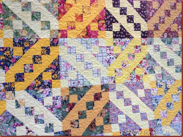
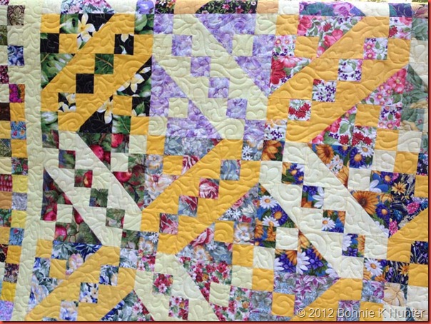
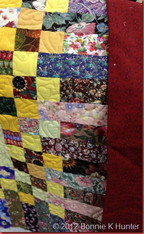
Don’t you LOVE this texture?
I don’t remember the name of the pattern, I don’t have time to look it up right now, but remind me another time and I will find it ---it’s a leaf and a swirl thing.
I just love how the yellows change and how the florals blend into each other, and even the ugly ones are NOT THAT BAD! Right? RIGHT?!?
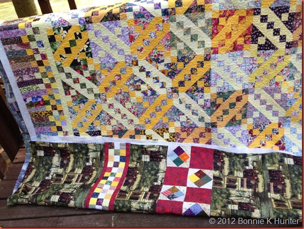
And see --- that pieced backing isn’t so bad either. It’s that Paris fabric that is kind of…ehhhhhh? But the patchwork bits tie the backing to the front!
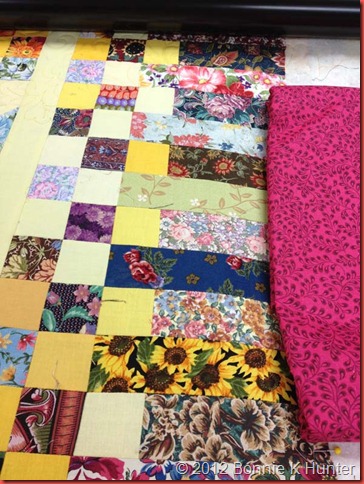
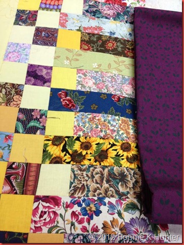
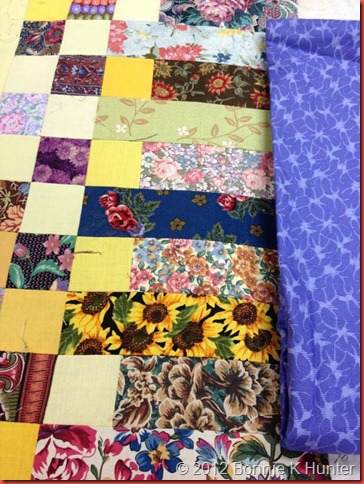
Now I’m wondering about binding……It could go so many ways, and while I was quilting, I was pulling samples to see what might work:
With the red in the back, I was thinking even red as binding? Love a red binding --- but does it do what it needs to to the front?
I could go hot pink?
Or a deep purple with little teal leaves?
And then there is Periwinkle. What’s not to like about a color called Periwinkle? Who made up that name anyway? LOVE it!
((It’s reading more blue here, but it really is purple-ish))
So let’s end this with a POLL! Which color would YOU bind it with? I don’t want any more yellow…..and I don’t want a scrappy binding because it will disappear against the border. I want one color, one fabric on the edge --- of the above 4 what would you choose?
And I’m off to throw the last things in the suitcase and get my butt to Delaware!
Happy Saturday, Everyone!
I'm seeing a blue binding.... like the sky surrounding the sun and protecting the flowers.... or is that too deep for this early in the morning. :o)
ReplyDeleteSafe trip!
Purple!
ReplyDeletevery nicely done. I voting for the darker burgundy or the darker purple ( I would pick the burgundy- I don't care for purple) - but it looks nice with this, so either of the two.
ReplyDeleteI vote for the deep purple with teal leaves. Looks great
ReplyDeleteBonnie, I'm liking the periwinkle for binding. On a color wheel it is kinda sorta across from the yellow making for good pop, but also blends with all the blues in your florals.
ReplyDeleteI vote periwinkle. It will pick up those lighter bluey/purple pieces of the lighter blocks.
ReplyDeleteOh, and WHAT ugly floral? LOL! No such thing - especially when it's cut that small and there are so many different ones.
I vote for the dark purple, too.
ReplyDeletePURPLE!
ReplyDeleteI like the purple too. I'm more of a 'go with blue when in doubt', but the purple speaks to me. Have a great trip.
ReplyDeleteGail in VA
Deep purple w/ teal leaves..just the thing for yellow and the various lavendars in the top fabric.
ReplyDeletePeriwinkle!
ReplyDeleteI'm voting for the 1st one, red or burgandy. I feel it will not clash with the back or the front since they both have a shading of that color. Bind it with whatevery sings to your heart. It is very pretty.
ReplyDeleteI vote for purple....then I vote for sending it to me!
ReplyDeletePeriwinkle for sure! And not just because it's my "color" (you know, the one color that you look your absolute best in) lol. I think they others are too dark, but the periwinkle plays perfectly with the rest of the top, imo.
ReplyDeleteI vote for purple....then I vote for sending it to me!
ReplyDeletePurple!
ReplyDeleteI like the way the dark purple frames it, but is it really bad with the backing? If so, Red.
ReplyDeletePERIWINKLE!
ReplyDeletePeriwinkle blue/purple will really frame the quilt.
ReplyDeleteperiwinkle!
ReplyDeleteI love the dark purple. This quilt is beautiful!!! Love it!!! Have a safe trip!!
ReplyDeleteYou didn't show a yellow choice but I think it would be great to pull the yellow to the edge with the binding.
ReplyDeleteDeep purple, definitely. Cheri
ReplyDeleteI'd go for the red...... I seem to be in the minority here, but I would choose the red, hands down!
ReplyDeleteI know it wasn't a option.. but I would do yellow... pull the different yellows of the quilt for the binding.
ReplyDeleteMy vote is for the deep purple. And I love the quilt. Wish I had the moxie to use color the way you do!
ReplyDeleteDEEP POIPLE!!!
ReplyDeleteDark purple!
ReplyDeleteHOT PINK! I was not a fan of the cheddar but am now obsessed with finding it for a quilt of my own! This is simply a work of art- since I am a novice at quilting will get there someday!
ReplyDeleteMy choice also. Carlene Foster
DeleteDef. the HOT HOT HOT pink!
DeleteI vote for a pieced binding of all the colors!
ReplyDeleteMary Ann
zenthea@comcast.net
Periwinkle or dark red. Both look good, but I was wondering about a rich green, since it would work with the yellow and all the leaves.
ReplyDeletePeriwinkle or dark red. Both look good, but I was wondering about a rich green, since it would work with the yellow and all the leaves.
ReplyDeletePeriwinkle or dark red. Both look good, but I was wondering about a rich green, since it would work with the yellow and all the leaves.
ReplyDeletePeriwinkle or dark red. Both look good, but I was wondering about a rich green, since it would work with the yellow and all the leaves.
ReplyDeleteI vote for the first one. I'm looking forward to seeing you in New York. Have a good trip to Delaware.
ReplyDeletei like the pink and would argree with teachpany... that a green would also go.. but bright it is for me with the top so spring and bright...
ReplyDeleteokay pinkness is calling ...
see ya have a great trip...
ter
purple or red! everyone is picking something different...so now what will you do?
ReplyDeleteReally looks nice, that looks like a jacobs ladder pattern. I would use the dark purple since it calms frames it nice.
ReplyDeleteIf it were my quilt for the binding, black or maybe a dark gray, either would frame such a busy quilt nicely I think! I don't think the florals are ugly at all Turned out nice, Bonnie.
ReplyDeletedeep purple w teal leaves
ReplyDeleteDefinitely the periwinkle. That's how I'm reading the lighter blocks in your overall picture.
ReplyDeletePerwinkle
ReplyDeleteRed, but of course that is my favorite color, or you could try my next favorite and that would be Kentucky blue.
ReplyDeletePURPLE!
ReplyDeleteWow! I liked the purple before you even asked for our opinions. I just like the way it goes against all that yellow.
ReplyDeleteCan't believe I am voting for the purple...but think it looks fabulous!! LOVE this quilt!~P
ReplyDeleteLooking at the photo of the quilt on the deck, I would go with the purple. Judy in VA
ReplyDeleteIt's fabulous Bonnie! I think it needs the deep purple binding. Whichever you choose is going to be perfect.
ReplyDeleteThe red, because there is red in the back also. Or, I really like the idea of a dark green to accentuate the flower garden feel of the quilt.
ReplyDeleteI like the deep purple myself. I'm always amazed that taking all those different fabrics and putting them together creates such a beautiful quilt.
ReplyDeletePeriwinkle shines like a little stream of blue sky against all the yellow sun and flowers
ReplyDeleteI'd go purple. I loved it the minute I saw it, before you even asked our opinions, I was going to give mine :-) Have a wonderful trip!
ReplyDeleteHands down..Red/Burgundy! Beautiful job, Bonnie....
ReplyDeletewhen I look at the first photos of the quilt I see it mostly as a purple and gold quilt - so I vote for the deep purple binding :)
ReplyDeleteLove from Indiana! ~bonnie
Well, I am quite certain that it MUST be that dark red. Just ignore what everyone else has said. Really. It's that red that does the trick. Honest. Take it from me. I wouldn't lead you astray. Do the red thing. Red. Red. Red.
ReplyDeleteStoney Monte
spirit.in.stoney@gmail.com
PERIWINKLE PLEASE - that color just lends itself to florals, and brightens up the binding edge. LOVE IT!
ReplyDeleteHAve a fun time, then come home and relax for goodness skae lol. Let in "take your shoes off, put your feet up and chill" .. aka the Southern way to relax. OH! Jack D helps alot too Bonnie
Smilies
JUlieinTN
It turned out so great! I love the purple fabric for the binding, good luck on choosing :-)
ReplyDeleteHave a great weekend,
Laila
I vote for the Periwinkle Bonnie. It is a gorgeous color.
ReplyDeleteI pick red. I love the way it looks with yellow. One of my favorite combinations.
ReplyDeleteDeep Purple
ReplyDeleteI like either the purple or periwinkle. I think I will have to give this quilt a try, I have found that the way I buy fabrics and the way I use fabrics are very different. I love a beautiful mid to large scale floral, but I prefer to quilt with tone on tone or small scale prints. It is all that I can do to keep beautiful floral prints out of my cart.
ReplyDeletePeriwinkle!
ReplyDeletePeriwinkle!
ReplyDeleteRED, of course! Just remember, you asked - lol!!
ReplyDeleteLinda-kaye
i vote for the burgundy since it will compliment both the back and the front. Ramona from Maine sewnsew@live.com
ReplyDeleteI think the purple sets off the quilt the best, but second choice would be the pink.
ReplyDeleteI have to vote for Periwinkle because I work at a quilt shop called "Periwinkle Quilting & Beyond" in Saskatoon, Saskatchewan, Canada.
ReplyDeleteI vote for a purple binding ~ LOVE this cheerful quilt!
ReplyDeleteLove the purple with teal leaves. Awesome!
ReplyDeleteK Jones, Corona
deep purple is my first pick and then the periwinkle. looking good!
ReplyDeletePeriwinkle . . . hands down!!!
ReplyDeleteHot pink! Yay!
ReplyDeleteI like the purple the best, with the periwinkle second. Just adding my 2 cents. Love your work Bonnie!!
ReplyDeleteWow...such a range of comments and colour choices. I would go with the red. I think it would compliment both sides of the quilt. I believe in not forgetting the backing. Your binding should compliment it too. The red also pops some small amounts of red in the quilt top. Good luck!!!
ReplyDeleteScrappy Nanna in Ontario,Canada
Wow Scrappy Nana, great Ontario minds think alike. I was posting at the same time about the red complimenting the backing. Hello from east of Peterborough....love also how the posts makes us look like earlybirds when I was feeling guilty for sleeping in until 10....
DeleteDefinitely the red, it blends with back and front and accent all the colors you have combined on the top. No contest, RED, Red, Red. Oh, sorry I only have one vote. R E D...
DeleteIf it's the same red as in your backing pieces then that red.....if not definitely PERIWINKLE. Love the quilt and also have become a big fan of cheddar.
ReplyDeleteRed.
ReplyDeletePURPLE, PURPLE, PURPLE even though I'm a pink girl.
ReplyDeleteI think the red looks really good and pops the most of all the colors!
ReplyDeleteI think a yellow binding would be perfect, but since you don't want yellow, how about green? Green seems to be the dominant color of your backing and it would pick up the green in the leaves on the front. If I had to pick from your 4 choices I would go with the purple.
ReplyDeleteValerie
from this view, my vote is the periwrinkle. have fun!
ReplyDeleteI vote for either the red or the periwinkle, depending on how much color you are looking for on the edge. I think both would look good. Love the quilt, Bonnie, and you are right, the texture is great! Have a great trip!
ReplyDeletePeriwinkle gets my vote :o)
ReplyDeleteI like the RED! pulls it out of the quilt.... Have a fun week!
ReplyDeleteCarol in BC,Canada
Well, you know that I ALWAYS go for anything to do with the color purple! But in this case, I think the periwinkle (which is a lighter purple) would be the best choice!
ReplyDeleteSafe travels my friend!!!
I vote Periwinkle. It's just a beautiful color and the and it matches the sheets on my bed.
ReplyDeleteI have an unrelated question. I went to my local goodwill yesterday and got something over 25 pounds of mens shirts to begin de-boning. (Loved your video tute!!) My question is are all the the shirts you use 100% cotton, or do you throw in a poly/cotton blend if you just can't pass up the color? I found a couple of hybrids that just worked perfectly with the color schemes I'm planning. In a normal quilt I would only use 100% quilt shop quality cotton, but in a scrappy, shirt quilt I'm just not sure. Thanks for the input and think periwinkle!!
Pam in Tacoma
Purple with the teal leaves. I never thought of purple and yellow together until my niece requested those colors for her graduation quilt last year. They go together perfectly! Safe travels to you Bonnie.
ReplyDeleteLove the purple!
ReplyDeleteI like the periwinkle if it goes with the back, otherwise the purple.
ReplyDeleteI seem to be in the minority, but I like the pinky red better. It seems to brighten the quilt to me, but then I am looking at my computer monitor that isn't necessarily giving me a true color. My second choice would be the periwinkle.
ReplyDeleteHave a safe trip. BTW---is your quilt panto done by hand guidance or is this a digital pattern? Thanks in advance for your response.
I like the periwinkle it lightens up the front and back. dorenemc5@yahoo.com
ReplyDeletePeriwinkle is a grand color and brings delightful memories of Sanibel Island. The main 'drag' is Periwinkle Way. Blue and yellow are sooo springy looking!!
ReplyDeleteHot pink!
ReplyDelete1. red 2. purple 3.periwinkle 4. pink :>)
ReplyDeletePeriwinkle!
ReplyDeleteThe purple really popped out at me.
ReplyDeleteI think purple would be great.
ReplyDeleteI would go with dark purple or a dark green. Great work!
ReplyDeleteHope your classes are fun. Happy Trails :-)
the purple is great, but my vote would be for a yellow :)
ReplyDeleteI'm in the red catagory. But then, I love it, and am all about contrast.
ReplyDeleteLooks like you're getting lots of advice :0) I like the purple.
ReplyDeleteI like the deep red, but I really would like a dark brown. It would go well with the background, pick up the brown in the quilt, tone down the yellow and do lots of things.......I love the quilt, and I had a whole tote of florals I got rid of not long ago, and wished I had ekpt them, as I would love to make this......I love it, and I love the backing....Have a great trip. Wish I was with you! :)
ReplyDeleteI'm partial to the red. I love red and yellow together, and I think the red helps tie the back together as well. Have fun on your trip!
ReplyDeleteI like the periwinkle. But purple is fine also.
ReplyDeletePurple, because it seems to pick up the colors of the quilt best.
ReplyDeleteTo my eye the red brings out the richness of the fabrics....
ReplyDelete~Jillian in North Dakota
How about laying some greens next to it? I'm thinking possibly a green shade.
ReplyDeleteHOT PINK! It will pop and also tie the colors together on the back.
ReplyDeleteI love purple but to bring the back and the front together..definetly the red. Bonnie have fun deciding.
ReplyDeleteNothing like a mix of opinions! Definitely periwinkle!
ReplyDeleteI have not read all the other comments - I would go with the RED!! Catherine in SW IN
ReplyDeletecsimmons2100@yahoo.com
1. Red
ReplyDelete2. Purple
Purple. It makes some of those blocks really pop!
ReplyDeletered
ReplyDeletePurple..natural compliment to the yellow and you can tell by looking...looks great with the top
ReplyDeleteRed would be my choice.
ReplyDeleteEither the pink of the purple, because there are alot of that in the flowers in the middle of the quilt.
ReplyDeleteI'd have to vote a rich green, would tie all in together and would set off the backing great! Otherwise I would second the periwinkle!
ReplyDeleteThe name Perriwinkle does it for me.... and would be an incredible contrast to all those gorgeous yellows....
ReplyDeleteMy 50 cents worth... *grin*
Rosa Robichaud
Saint John, NB
robich@rogers.com
I like the deep purple -- or maybe even cheddar to bring it all together! :o)
ReplyDeleteBinding.... I would use a deep green! Something to pull a green from the backing, but to also accentuate the leaves in the florals...
ReplyDeletePeriwinkle is the blue of the flower by that name..........
ReplyDeleteTry a bright yellow in the binding audition.
Love the quilting and everything else about the quilt too.
Safe travels and Happy Sewing :0)
Green would be my choice even though you did not show us a green. LOL Thanks for sharing the Floribunda in all its stages--just like Spring!
ReplyDeleteArdis
I like the red!
ReplyDeletePurple by far for me.
ReplyDeleteMaryella
Periwinkle definitely!!
ReplyDeleteI like a dark colour for a binding - calms down the middle - so vote for either the red or purple. If green was an option I probably would have chosen that - green goes well with flowers.
ReplyDelete#1. hot pink
ReplyDelete#2. purple
the others seemed too light to me ;-)
It must be purple!!
ReplyDeleteI'd usually say Purple, but Periwinkle is very Springy and I like the name too. Anybody "google" it to find out where the name came from. Nice that you got it all quilted in spite of your 'short sheeting'.
ReplyDeleteThis will be different...surround it in sunshine! Cheddar! If not cheddar then the red.
ReplyDeleteLynne in Hawaii
hot pink, but that's just 'cause I like it. Probably the purple would look better on you quilt.
ReplyDeletePurple...but did you try a dark yellow gold? Love the quilt. Thanks for the inspiration!
ReplyDeleteDark purple, I usually prefer a darker shade to bind quilts for some reason.
ReplyDeleteRed please
ReplyDeletePurple - ;))
ReplyDeleteI like the purple. I blends and pops at the same time. I do not know how that works but that is how I see it.
ReplyDeleteDark purple. I think the quilt reads purple from far away and the purple would finish it off.
ReplyDeleteI would suggest black, as the fabric we see in the block with the white and pink flowers, for the binding. And it would go with your Paris fabric in the back.
ReplyDeleteIt is hard to choose when we don't have the quilt in hand.
I am sure you will find the right color when you come back.
Very nice quilt,
Carole
Without a doubt RED!!!
ReplyDeleteDeep Purple but if you don't want that ....red.
ReplyDeleteDeep Purple but if you don't want that ....red.
ReplyDeleteRed Bonnie!!
ReplyDeleteI like the red:)
ReplyDeleteI vote for the periwinkle.
ReplyDeletePurple!
ReplyDeleteI likka the red! Zings it!
ReplyDeleteJune from momabeel@rochester.rr.com
I vote for the plue, nice idea to propose this pool! Thks
ReplyDeleteRED!! Red is ALWAYS right :)
ReplyDeleteMarei mdmontalvo@yahoo.com
I meant the blue :-)
ReplyDeleteBonnie:
ReplyDeleteAre you sorry you asked?
1. Periwinkle
2. Purple
Periwinkle looks like it matches best from where I am sitting, it seems to be the same shade as the purples on the front.
ReplyDeletePurple. The quilt reads purple in the pictures and the leaves tie in with florals.
ReplyDeleteI like the purple.
ReplyDeleteI vote deep purple.
ReplyDeleteJan
I love the RED!!
ReplyDeleteDark purple
ReplyDeleteRed!
ReplyDeleteLove the red and the purple. If it was mine, I would use the purple with teal leaves. Gorgeous quilt!
ReplyDeletePeriwinkle...
ReplyDeleteRed or purple. Florabunda is beautiful!!! Sandi1100
ReplyDeleteRed. Ardis
ReplyDeletepurple
ReplyDeleteDo like that hot pink, but I'm picking a fifth color: It is called black.
ReplyDeletehot pink, I think!
ReplyDeletePurple!! I like that best, I seem to be in the minority though. Have a great trip.
ReplyDeleteI really enjoyed meeting you in RI. I haven't made too much more progress on my Star Struck quilt as I have quilts for other people to make first, but I;ll send you a pic when it's done.
Thanks again for a great day,
cindy b
I would choose red.
ReplyDeletePurple
ReplyDeleteI'd go purple, then deep red as a second choice. Pink or periwinkle, while lovely colours, would not be my pick here.
ReplyDeleteBonnie, I like the purple best. Red is my second choice. It's beautiful!
ReplyDeleteConnie in Boise
Purple, it's the color of royalty. And after all,this is the one year celebration of the royal marriage ths week
ReplyDeleteThe periwinkle or the red.
ReplyDeleteLove the purple
ReplyDeleteBonnie, Bonnie, Bonnie, you know you are thinking RED!!! No matter what anyone else is thinking, I know and you know..... it's RED!!! that quilt is just screaming for a RED binding! Can't you all hear it screaming ;-). Remember Bonnie, it's RED!!! ;-)
ReplyDeleteI'm a red girl myself, but personally I think the purple binding would look best. (Those who know me are shocked, since I don't like purple ... but some things just look right!) I know it will be great, whatever you do. And these last pictures make me think I just HAVE to do a Florabunda after all!
ReplyDeleteFrom Portland, Oregon, where I got sunburned today -- that's a REAL shocker!
Purple would be my first choice! my favorite color.
ReplyDeleteBut.. had to tell if it would go with the back... so that would make red my second choice.
Hot Pink and it is such a beautiful quilt Bonnie
ReplyDeleteI like the red - definitely not the periwinkle - gives the quilt a cold look.
ReplyDeletePerriwinkle
ReplyDeleteyellow would be perfect...However it isnt an option so I choose the teal....
ReplyDeleteRed is my favorite colour, BUT I think that the deep purple REALLY grounds all those florals and reigns them in!! Oh, please pick the deep purple! I think it is really the right choice!!
ReplyDeletePeriwinkle or Pink. The others are boring!
ReplyDeleteLove this quilt! Makes me want to make more Floribunda blocks - just need to source some plain yellows because I have florals coming out my ears LOL.
ReplyDeleteI vote Periwinkle or Purple (but then I would hee hee) xka
I vote for purple.
ReplyDeleteI like the purple, too. BTW, there is a flower called the periwinkle. I think that is where the name of the color came from.
ReplyDeleteDeep purple or hot pink! Both make a definite statement about their being there! POW!
ReplyDeleteBev (kwiltpharm@aol.com)
I love, love ,love periwinkle, but in this case I gotta go with purple.
ReplyDeleteI see no ugly fabric in this little beauty. You amaze and inspire me.
Red! I like the red best. It's a classic binding....the other colors are beautiful but maybe distracting from the quilt...they deserve attention of their own (esp that periwinkle!)...and I would want people concentrating on the quilt. That periwinkle and hot pink deserve more regal status than binding!:) Just sayin....
ReplyDeleteI think you got more votes than Ron Paul. Anyway, mine is purple. Lane
ReplyDeleteLooking at the whole top and not just the sample pics, I like the purple. Makes the yellow sing!
ReplyDeleteIf it is not to late I vote for the purple.
ReplyDeletePurple feels right to me on this one...
ReplyDeleteJaci
luv2quilt1965@yahoo.com
Is it too late to vote? I like the purple with the teal leaves. Adds a red note that compliments the backing fabrics but also adds a purple note that goes with some of the light purples on the front. It's also strong enough to add definition to the edge scrappy edge.
ReplyDeleteI vote Purple. It will work like a picture frame to bring the eyes to the blocks.
ReplyDeleteI think the Red is the best!
ReplyDelete